
Instacart
Enabling collaborative orders for family and roommates
+20%
The average American household has more than three members, however, Instacart’s early version of Family accounts only allows one additional user. We frequently hear from our users who want the option to include additional members on their accounts. To expand our family groups user base, we are giving users the ability to add three members to a group.
Sharing accounts also means expanding Instacart account holders, as well as number of orders and increasing basket size. We created a cohesive, more visible Family experience in numerous parts of the product, releasing in two launch cycles.
Family account completion
+6%
Collaborative order rate
+5%
Secondary users placing orders
The Team
Me - main designer
1 content designer
1 product manager
1 researcher
3 iOS engineers
3 Android engineers
1 web engineer
My Role
As the main product designer on the project, I collaborated closely with Product and Engineering counterparts to iterate on multiple projects in parallel, all under the Family umbrella. For a successful launch, it was critical that all features of the larger project were built and launched in tandem.
Phase 1
Family on Account Tab
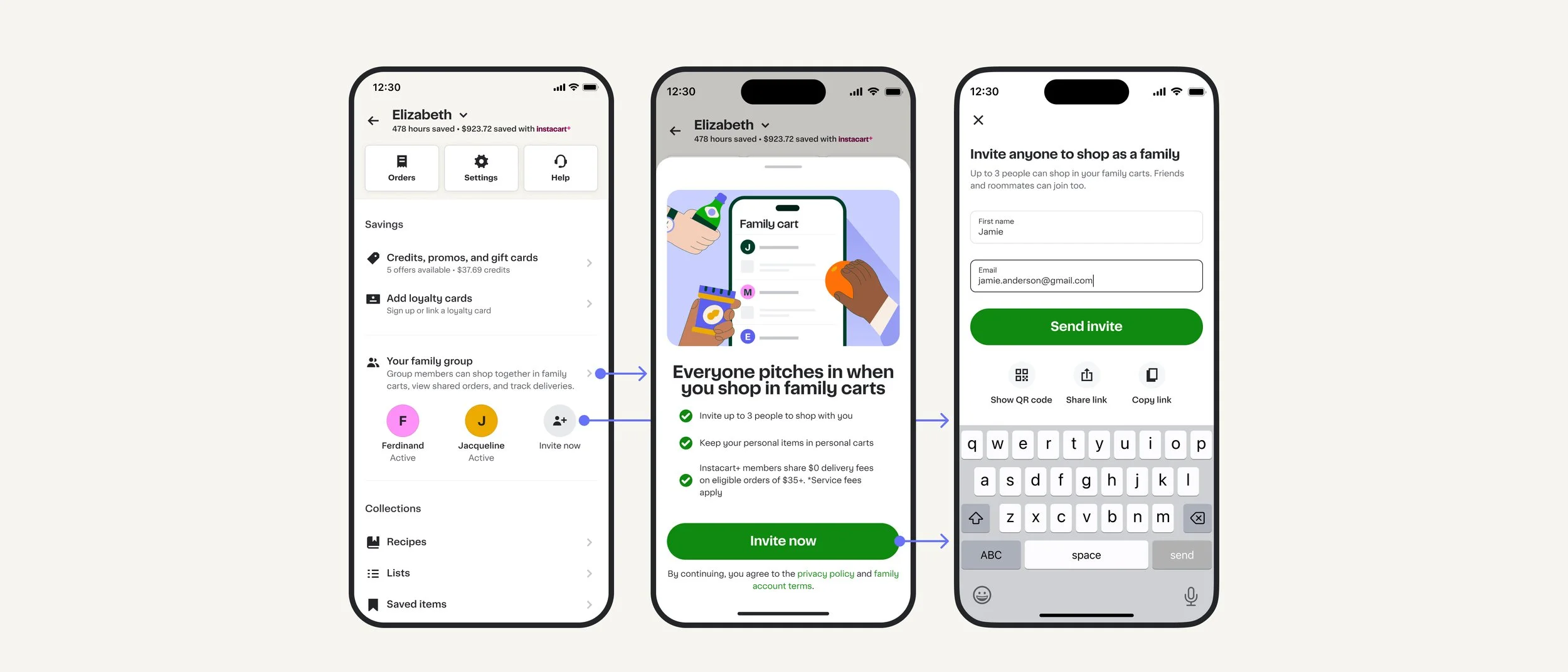
As an initial test to understand how much users will use the additional Family invitations and measure number of collaborative orders, we started with a lower-effort, and potentially high-impact addition in the Account tab. Account tab gets enough traffic to test usage, yet it doesn’t require a larger IA overhaul.
What started as an entire surface for Family, was quickly reduced to a sub-section in the Account tab after distilling the concept down to two main actions: “Invite” and “How it works”. This only required minimal real estate, and pushing it to the main Account surface gave it much greater visibility. On launch, the addition had a large impact on Family account adoption and collaborative orders, so we were clear to carry on with a larger Family feature push.
Phase 2
Family as an Onboarding step
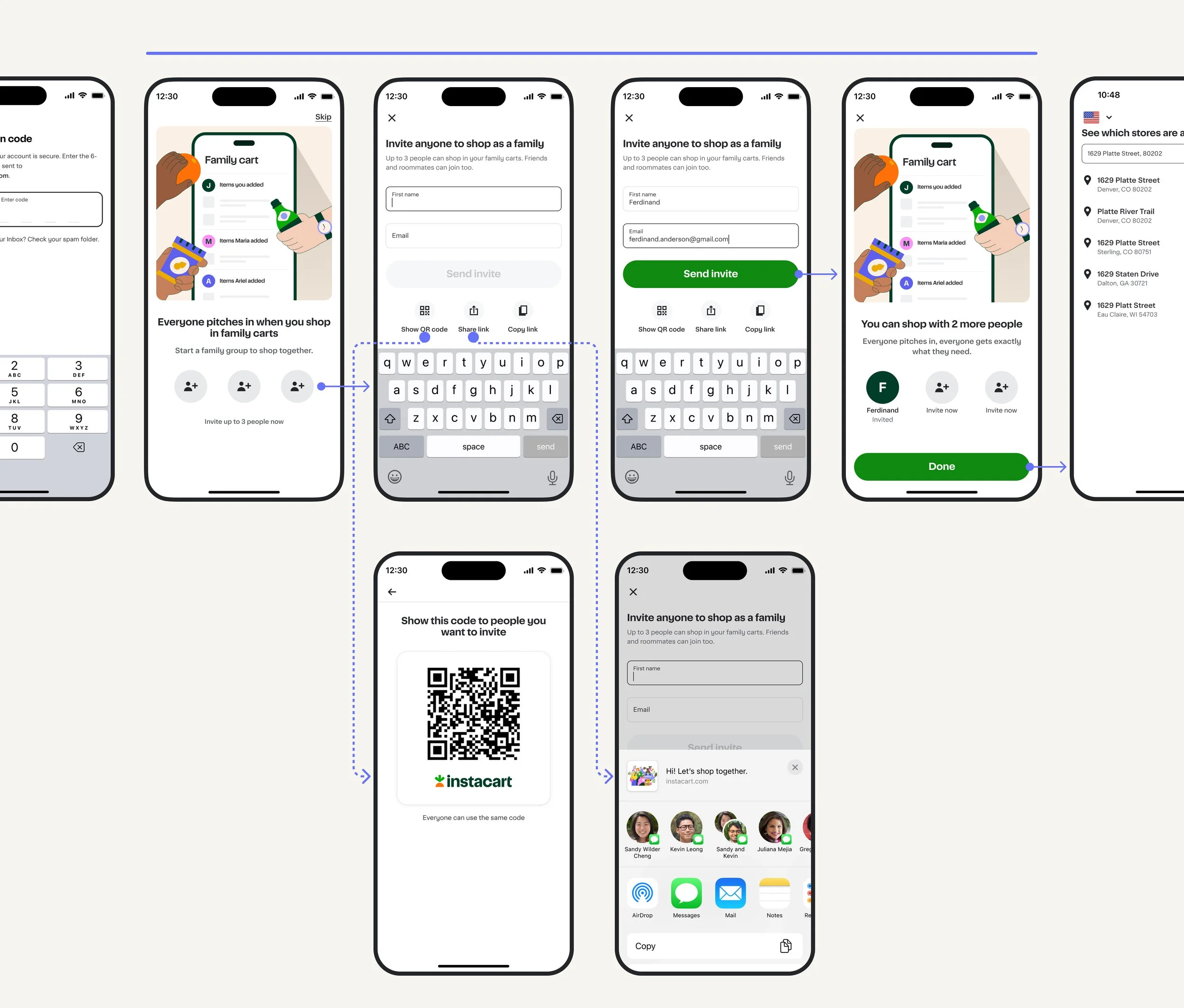
In the Instacart onboarding flow, users go through a quick series of questions to set up their account. During a user’s first interaction with Instacart, we have an opportunity to introduce Family functionality early, teeing up the value of adding members to their account. In order to encourage usage, the feature should illustrate core value to the users, while being seen as a step, and not an upsell.
Design considerations
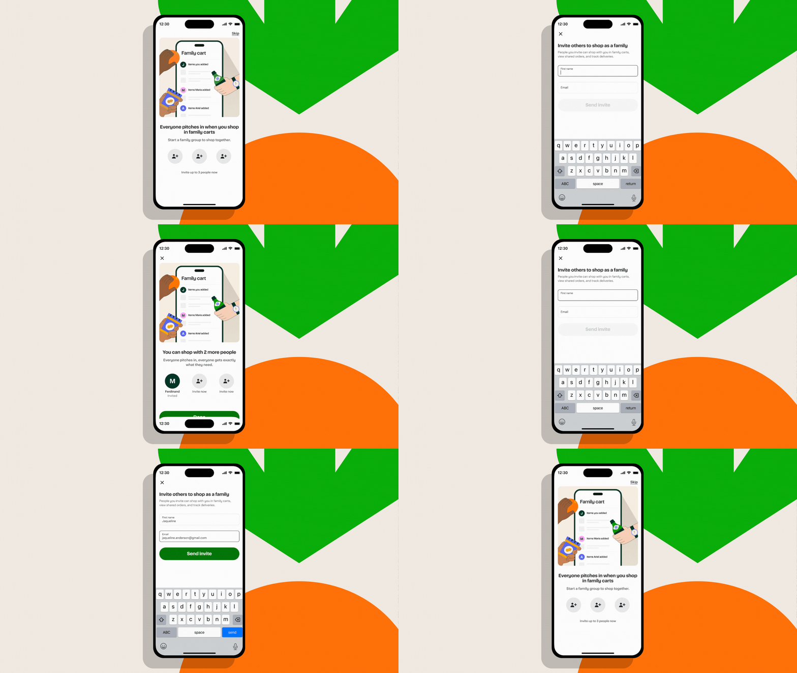
Because we want to get new users through Onboarding quickly, illustrating the value of a Family account in one screen was critical. The design leans on the illustration to get the idea across, while showing three icons as action buttons to send three invitations. Users have multiple ways to share an invite, but sharing an email allows Instacart to follow up on the action. Users can also share via QR code, share sheet, or copying the link. Here, I worked through the flow and concept, while collaborating with our creative team for the final set of illustrations.
Phase 3
Storefront & Cart entry points
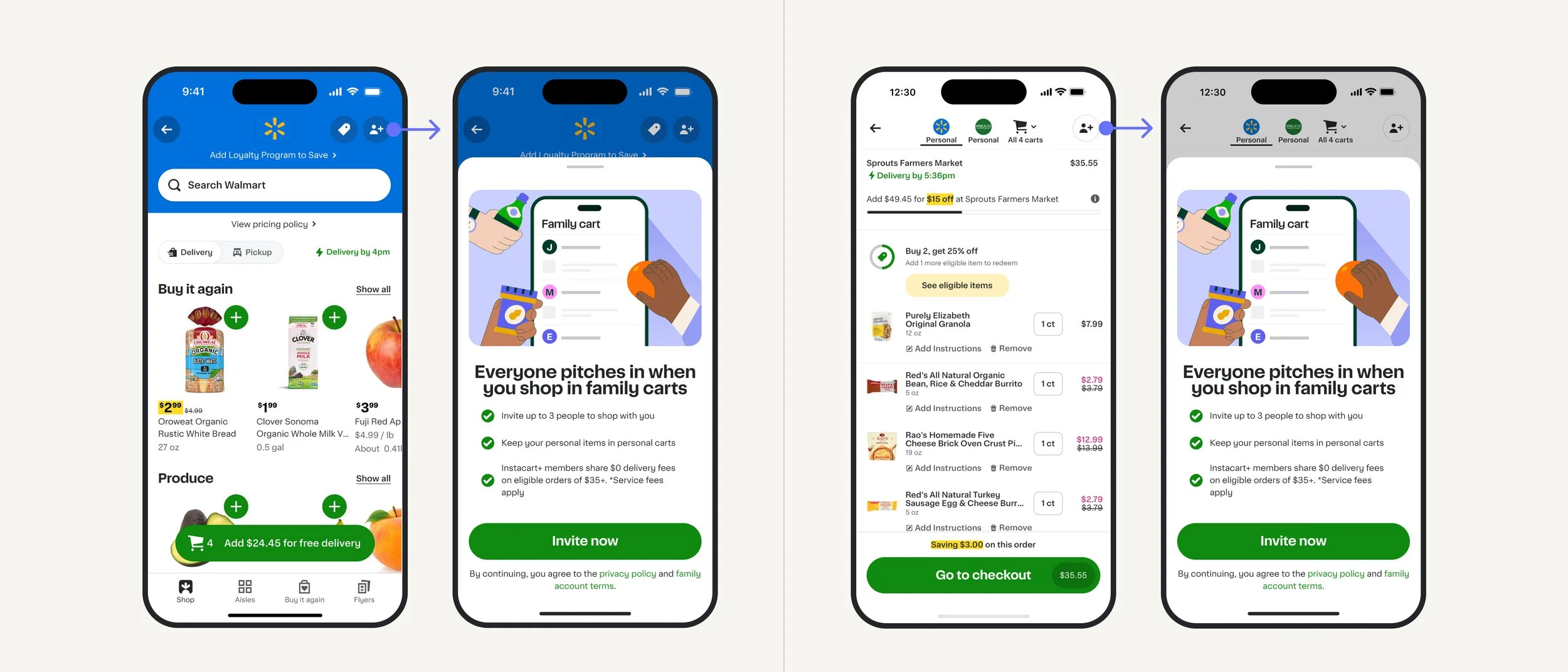
In order to meet users where they’re at, we wanted to make it easy for them to add family during key parts of the shopping journey. After considering numerous placements, the team aligned with usability studies and landed on an entry point that lives in the top right corner when entering a retailer storefront. Tapping the add family icon shows key value props in a sheet, and takes the user to the same onboarding flow as above. Once a user has added family, this icon becomes a family management entry point.
To punctuate the shopping flow, the family icon is shown in the same spot while in cart as well. Users spend time on this surface for budgeting, planning, and marking items off the list before checking out. Adding family here and showing each member’s individual cart items is a key value add.