Serving our users deeper insights into companies and jobs, while restructuring the app to support new features and inspire growth.
Glassdoor is shifting from a linear search-based, transactional model to a recommendations-based approach that gives job seekers transparency and personalized insights into jobs and companies.
In order to simplify users’ tasks and adapt to new feature offerings, the Glassdoor app needed its information architecture to be restructured. The app needed to make room for new product features, and to be flexible enough for those to come in the future. Users needed a simpler way to research jobs and companies, see more personalized recommendations, explore and save content, apply to jobs, and prepare for interviews.
My team had 6 weeks to work with an agency to develop concepts, test, and present to leadership.
The Team
Myself, lead designer
2 contract designers
1 Product Manager
2 Engineers for guidance in ideation
1 Researcher
My Role
I led a team of two designers from a third party agency on the project, and collaborated with them on defining the goal, concepting and ideation, and putting together a working prototype. We worked with my team’s product manager, and brought engineering in to keep us within feasibility guidelines. With PM, I presented our explorations to leadership in order to shed light on our opportunities and to get buy-in on moving things forward.
Research
What’s currently working?
Convenience: job search on the go
Breadth of content: great resource for research
Fairly personalized
What could be improved?
Navigation
Overall UI
Job relevance
More salary data
More helpful tools overall
A moderated study focused on Glassdoor’s mobile app platform told us that the majority of its users utilize the app most for researching jobs and companies, and getting a feel for a ‘snapshot’ of the job. It’s easy for them to keep track of their steps and research on the app while commuting, on a break from work, or generally spending time away from their computer. When users are ready to actually apply, they tend to transition to the desktop platform, unless the job is a one-click ‘Easy Apply’ listing. Users want to maintain a seamless flow between platforms, with consistent features and actions.
Users love that reviews, salary data, and interview questions are so easily accessible in the app, though many said they’d love to see more in-depth salary data.
User Personas
Four personas have been defined for Glassdoor users through prior research, so we focused our ideas around them to retain product-wide consistency and cohesion in our solutions.
High affinity: Gainfully employed, but open to a better fit
Growth: Looking for room to grow; different challenge, more compensation
Balance: Overworked; looking for better work/life balance
Insecure: Unemployed or about to be
Balance persona. Click to enlarge.
Growth persona. Click to enlarge.
Frustration Points
However, one of the biggest frustrations users brought up was the poor relevance of jobs that they see. Users wanted to see jobs that better match their specific interest areas, career level, and location. They wanted a clearer picture of the jobs and companies they were researching.
These stated frustrations further validated product features and tools we had in the works, and showed us where there was opportunity for growth and improvement. Aside from these user frustration points, it was clear as a product team that we had simply outgrown the current architecture of the app.
New features on the app such as Collections, Job Tracker, Profiles, and upcoming recommendation-centric experiences needed an architecture that could support them and inspire growth.
Defining the Problem
Users aren’t seeing enough jobs and insights that are relevant specifically to them and their careers; they want a more personalized experience.
Problem Statement
How can we serve our users more relevant content and deeper insights into companies and jobs, while restructuring the app in a way that it supports new features and inspires growth?
Opportunity
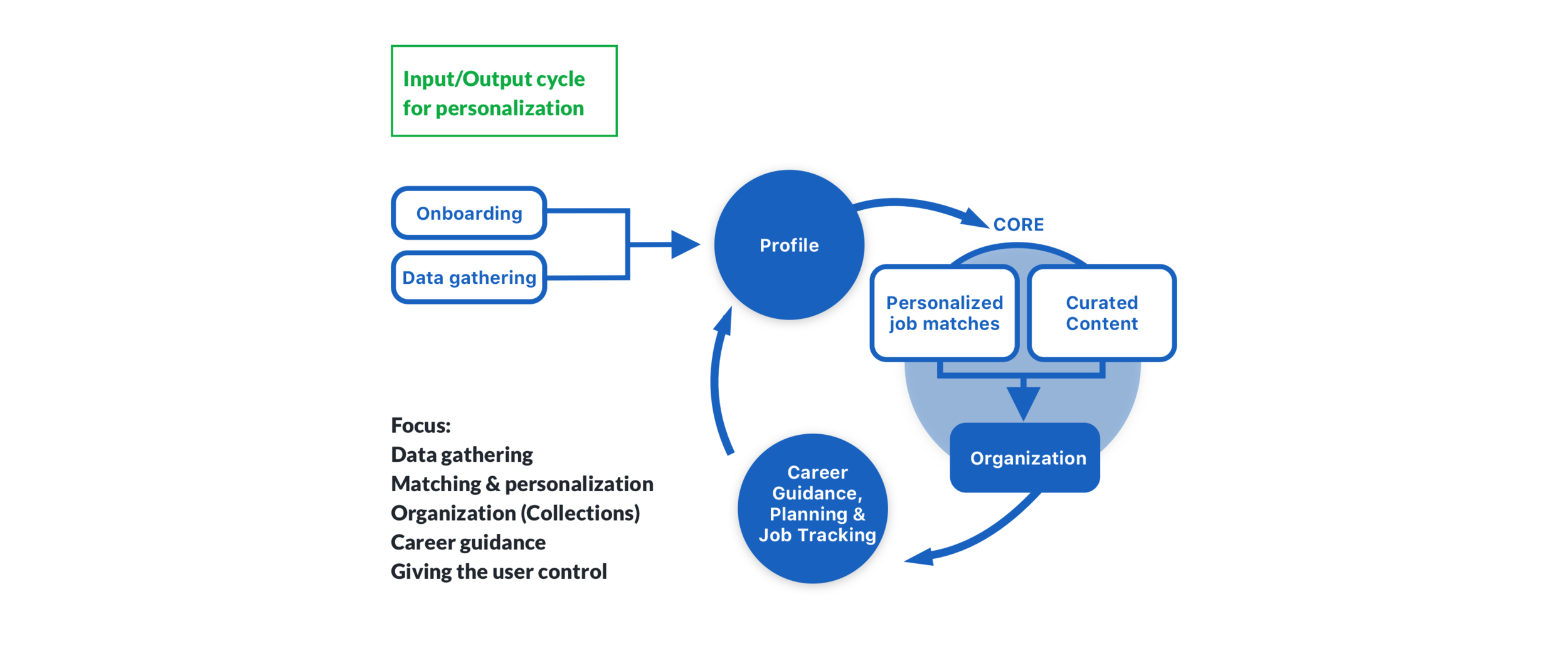
We can focus on building a long-term relationship with our users in order to guide them through their career and help them make the right decisions. We can do this by serving our users more relevant content and deeper insights into companies and jobs while learning more about them in consistent feedback loops. We can give them more tools to help them in their search, and re-architect the app in a way that supports new features and inspires growth.
Ideate
Through the lens of our previous user studies and test results, we carved out clear goals to improve the app in three categories: insights, recommendations, and an architecture to support them.
Starting out
We took a good look at all our compiled research of our app and mobile web users to identify their core expectations, needs, and see what’s missing. Through these findings, we focused on establishing what the focus should ultimately be on our mobile platform. In addition, we wanted to explore the best navigation to support these needs and the product features that solve them. By the end of our ideation phase, we wanted to have a more clear idea of what would give our users more value in the Glassdoor app, and what would set us up on a clear path forward after presenting explorations to leadership.
Brainstorm
Through a few sessions of group brainstorming and sketching ideas out, we finished up with three key points to iterate on, and began sketching and wireframing the result:
1. A focus on insights
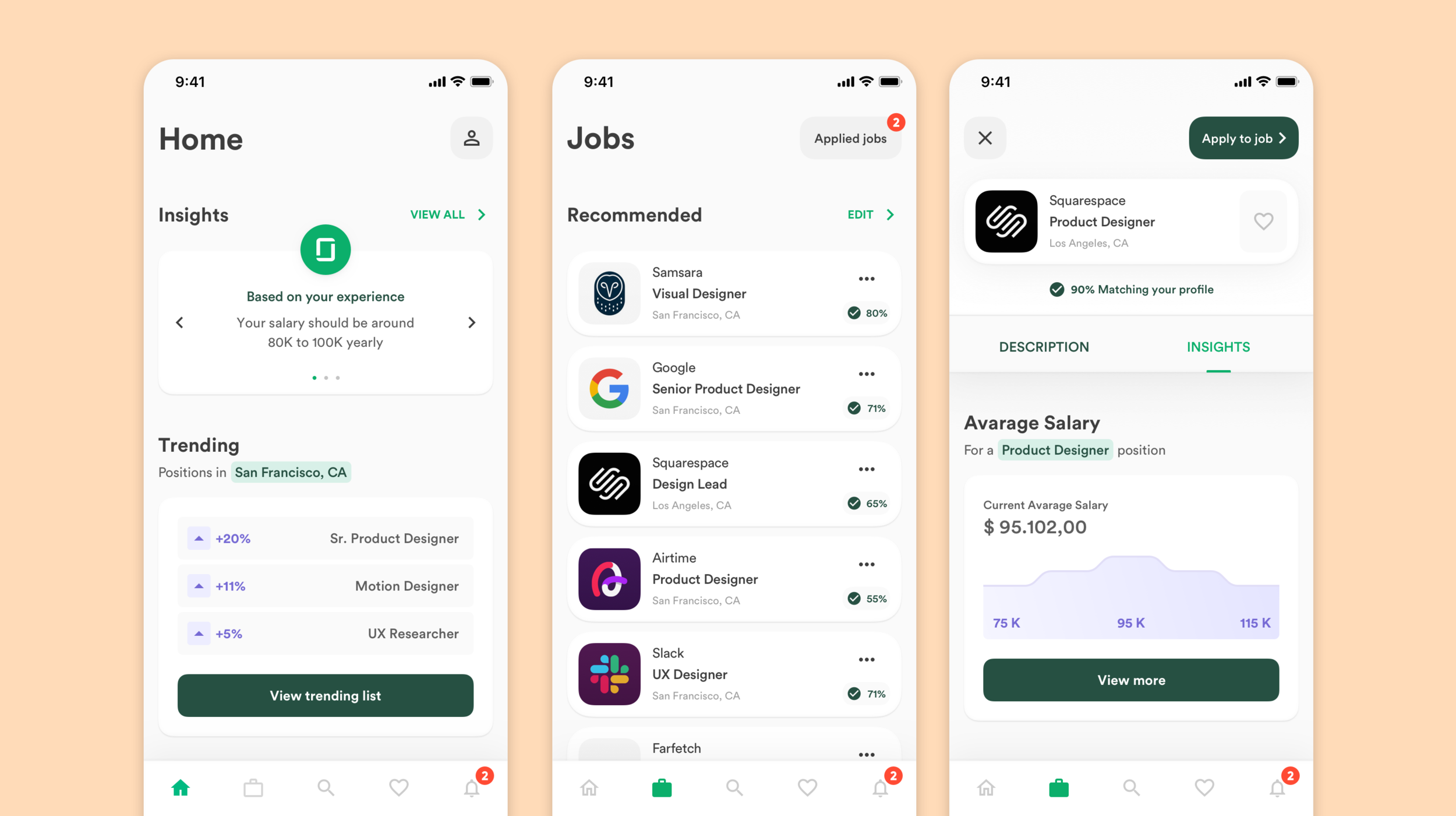
Users wanted a more clear view into what it would look like working in either a specific job, for a company, or in various careers. We discussed how we could better leverage and visualize the data we have by aggregating topics within our review content and spotlighting what’s most relevant. We also looked at highlighting trending jobs and salary data within the user’s location, or related to their industry peers.
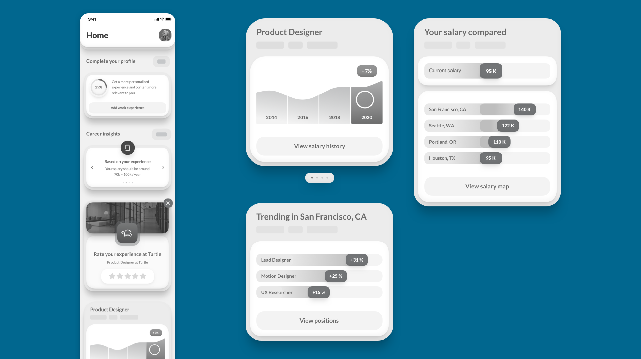
Insights modules are based off user’s location, career type, and behaviors in the app. The highlighted data is aggregated from existing data within our user generated content.
2. Recommendations & Micro-surveys
In order to serve more relevant jobs to users, we looked at implementing contextual micro-surveys throughout the experience, asking more specific details to our users about career interests, previous experiences, and what they’d like to see.
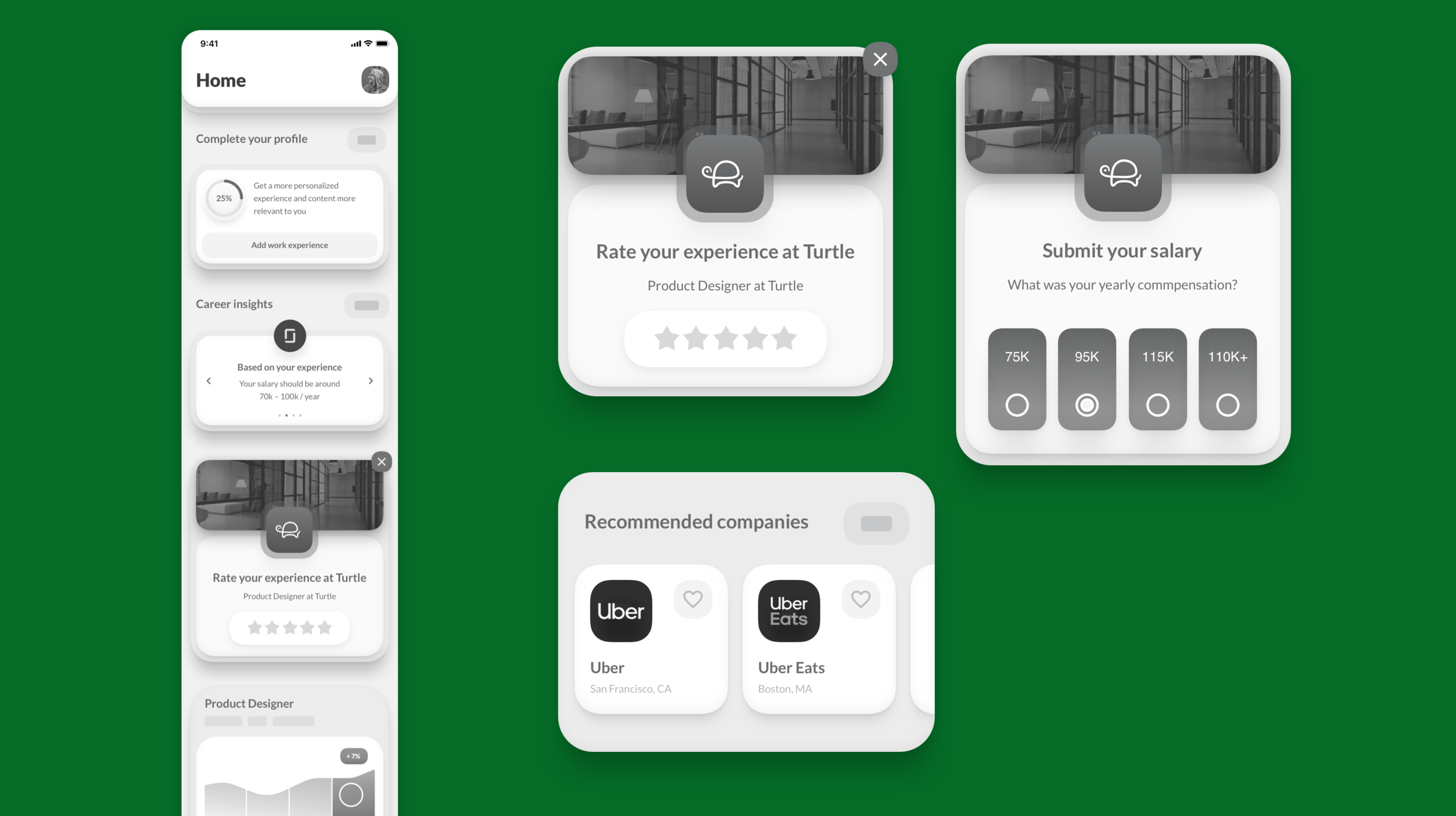
Recommendations are based off data the user contributes. They are rewarded with more highly personalized data the more they engage.
3. Improved Navigation
With the recent release of Collections, and from planning additional upcoming features, we focused on implementing a more clear and flexible navigation.
The new Collections feature had to be split from the Applied Jobs section in order to better navigate the two large features. We wanted users to be able to easily view career insights as well.
We decided to test two variations for navigation and move forward with the winner.
The first version featured a search function in the middle of the tab bar.
Talking points in design:
Observing users during previous testing sessions tells us that navigation to applied jobs is a challenge. To alleviate this,
When we introduced Collections, fitting it in the existing architecture was a challenge, and as a compromise, the Job Alerts section was buried. This was apparent when we saw clicks go down in a test bucket
So we..
At one point in time, the main goal and function of the app was for users to add written reviews and content in order to increase available content. Now, personalized recommendations and insight tools take precedence for the user. It was time to remove the plus button as the main focus point. Some users think it exists to add a job alert. Navigation to get to saved jobs has become difficult with addition of Collections, and job alerts have become buried (clear in metrics).